Problem
Having become fluent in Italian during high school, I found it challenging to practice my language skills in college. After speaking with many 18-23 year-olds who faced a similar problem, I identified a gap in language learning technology. Why are there fewer resources to maintain language speaking skills than learn a new language?
Objective
For an interaction design class, I built an interface that enables people to maintain their language skills by talking with native speakers. The catch? In order to practice your foreign language, you have to dedicate time to teaching others your native language.
My Role
Using a mobile-first mentality, I began the project with competitor and user research, developing personas before moving through wireframes to high-fidelity UI designs. Since first starting the project in 2016, I revisited the designs in 2018 and 2019 to continue to explore where I can push the design work.
User stories and variations on initial wireframes
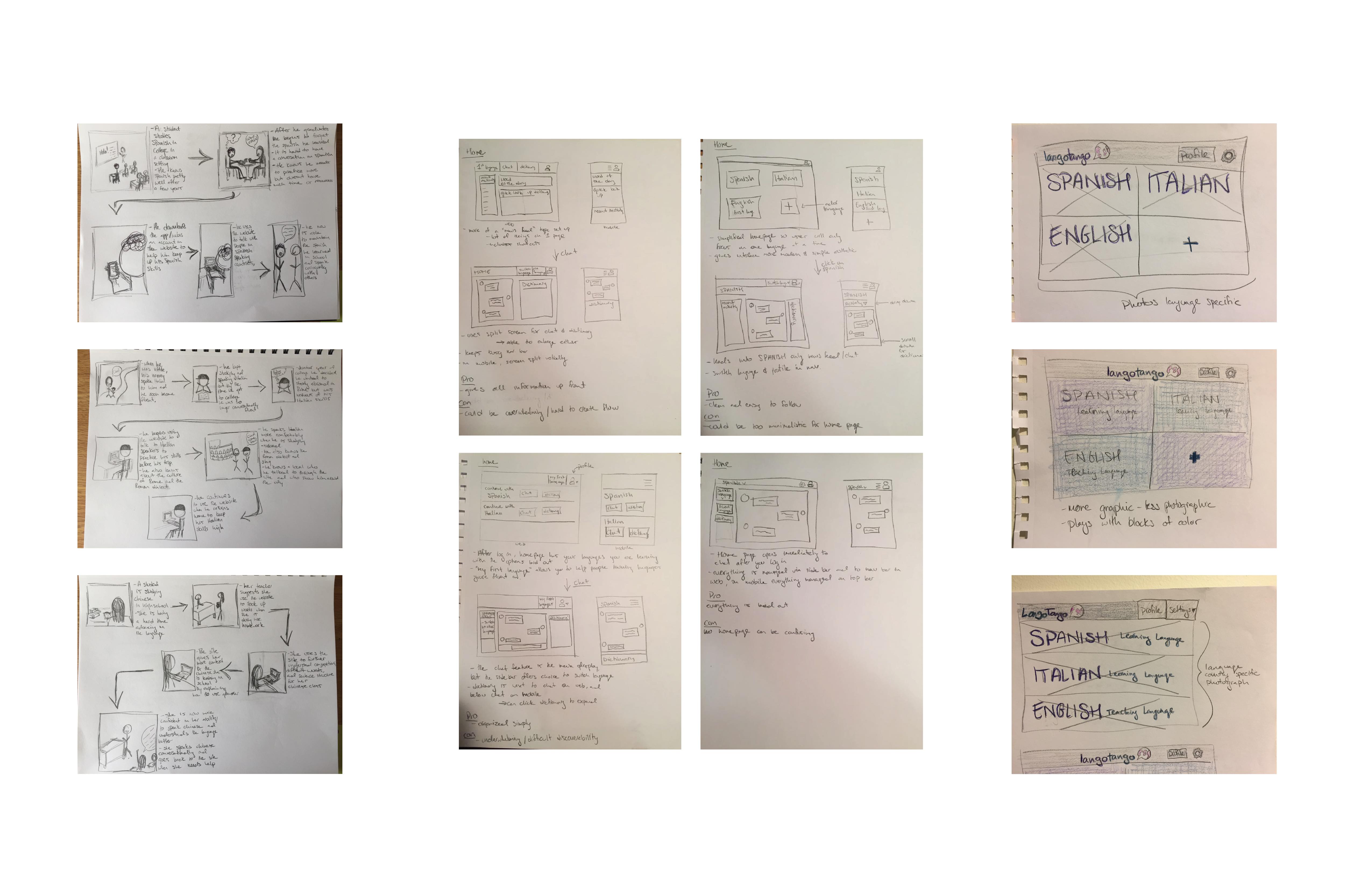
Beginning the design process with hand-drawn sketches allowed me to keep my initial ideas fluid before bringing them to my computer.
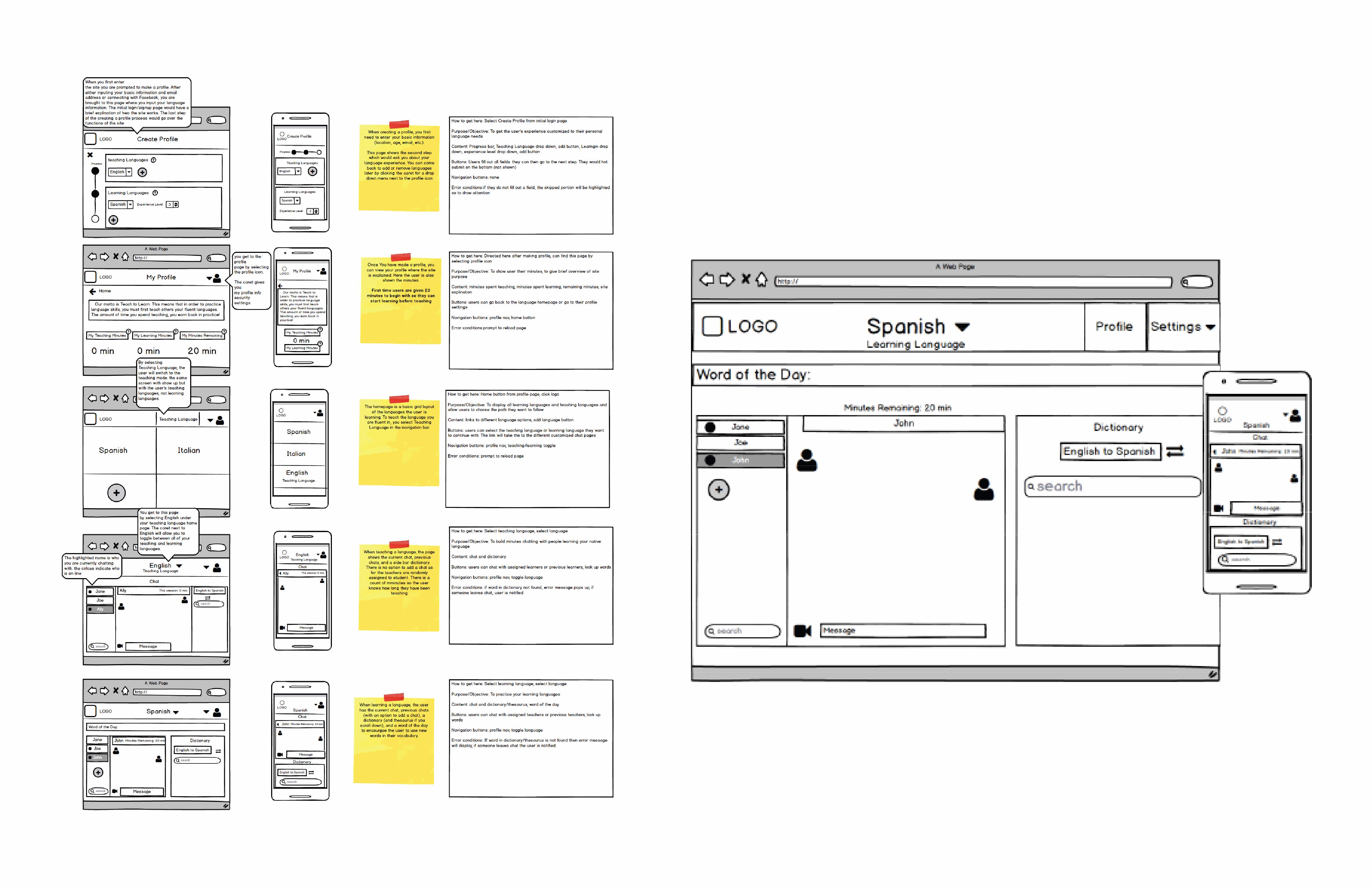
Low fidelity wireframes of desktop and mobile created with Balsamiq
I used Balsamiq to design the structure of the interface. This allowed me not to get distracted by design and focus purely on actions and structural capabilities.
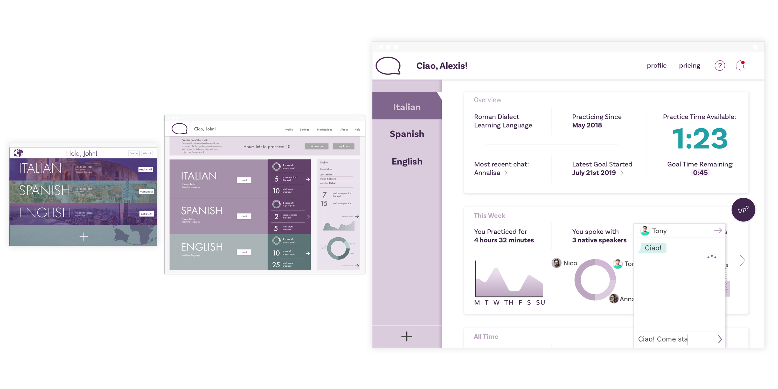
Evolution of the dashboard from 2016-2019
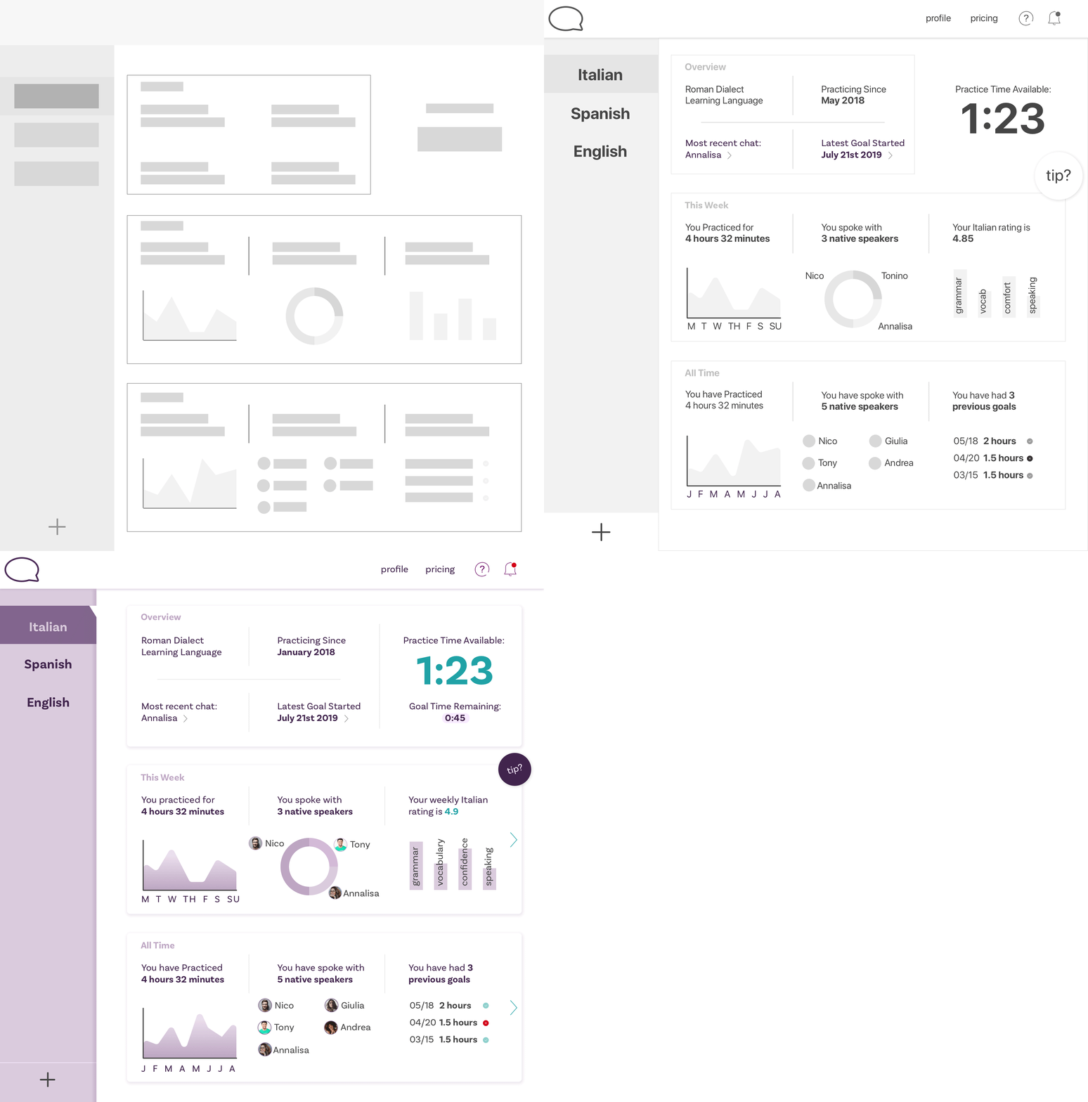
I have redesigned the interface UI and UX three times. Each time I focus on current design trends and pull from what I have learned.
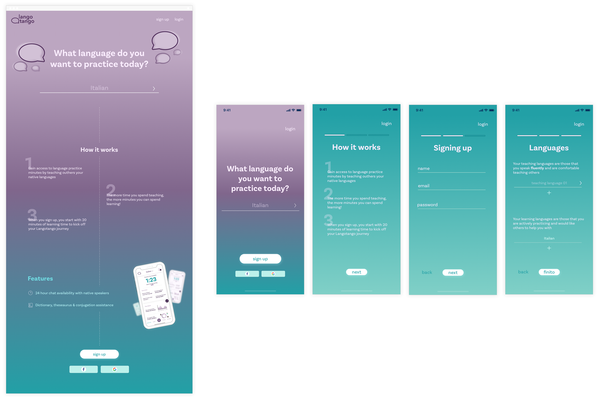
Landing and mobile onboarding screens
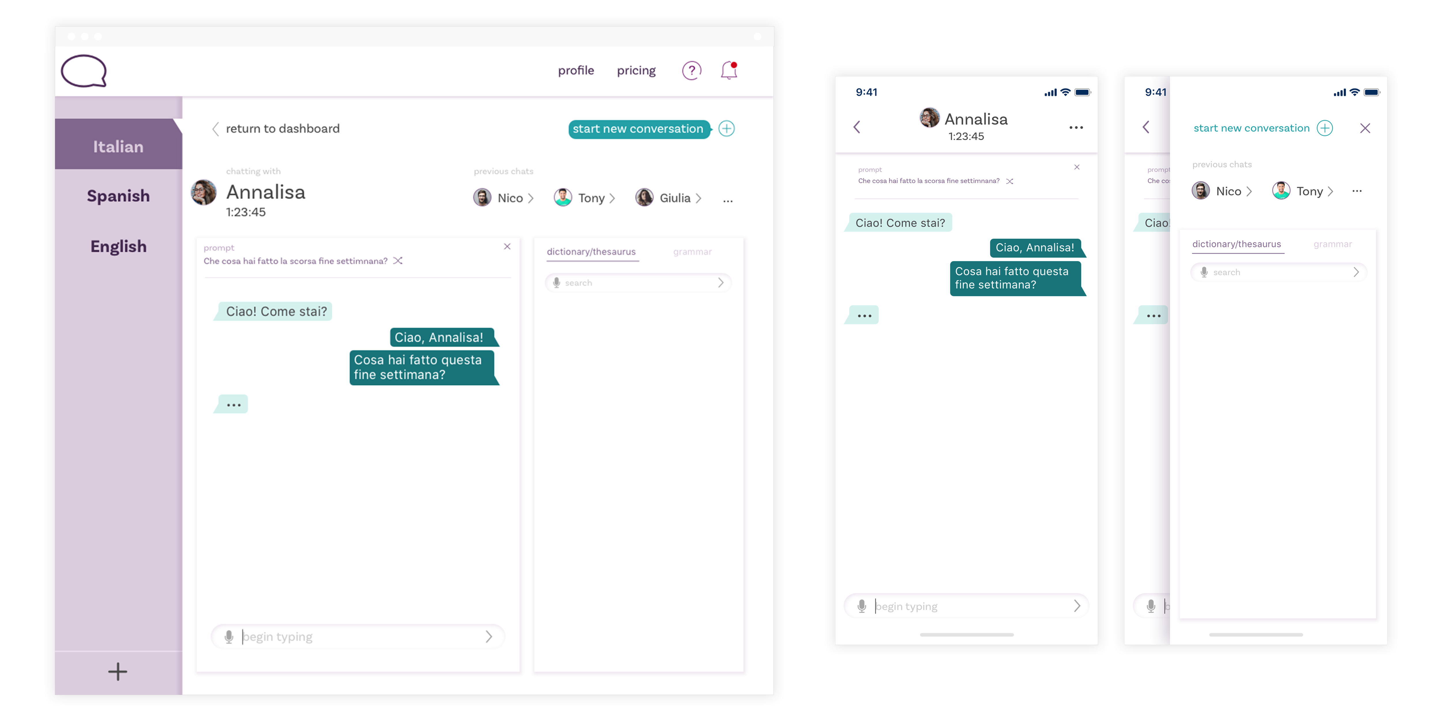
Desktop and mobile chat screens
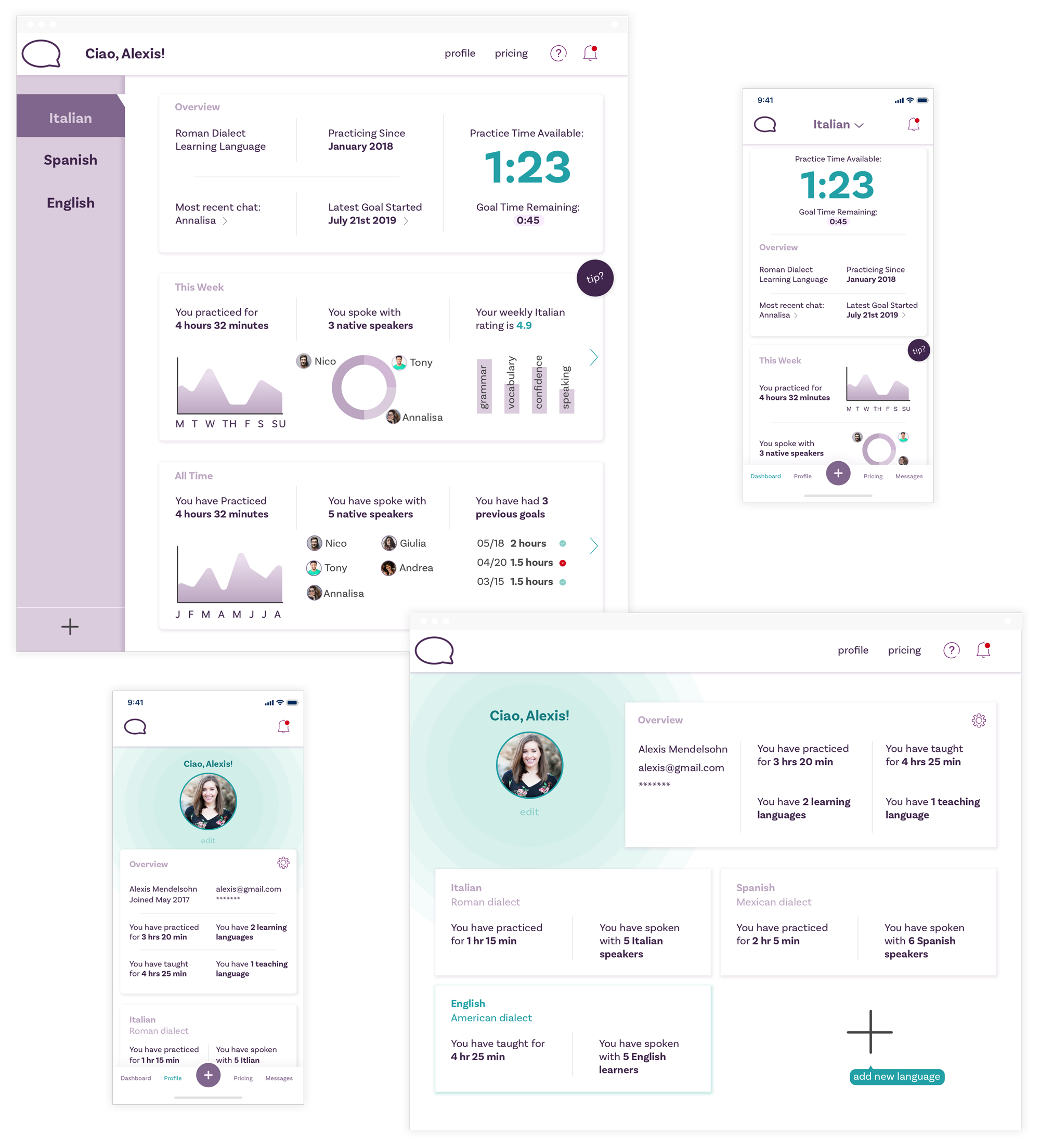
Dashboard and user profile
What's next?
LangoTango is my go-to passion project – one in which I am able to both harness my respect and love for language learning and experiment with current web design trends. I am currently working to build out the interaction design and clickable prototype.