Team
Product designers (myself +2)
Content strategist
The Problem
Buildium is an all-in-one property management solution designed to help customers, specifically property managers, with every aspect of their jobs. Despite frequent software updates, our design team was seeing a high volume of requests for features that already existed, confusion around workflows that had an abundance of documentation, and misinformation on plan upgrades. How could we improve our in-app messaging patterns to guide our users to important features, relevant help, and personalized upsells?
Design sprint
In October of 2020, I teamed up with two other product designers and a content strategist to run a week-long design sprint to improve our in-app discoverability patterns and establish messaging documentation. We defined discoverability as: the ease at which users can find features or functions within an app and learn to use what they find.
Timeline
Monday: Internal audit, outline use cases, track patterns and pain points
Tuesday: External audit, debrief on pain points, create problem statements
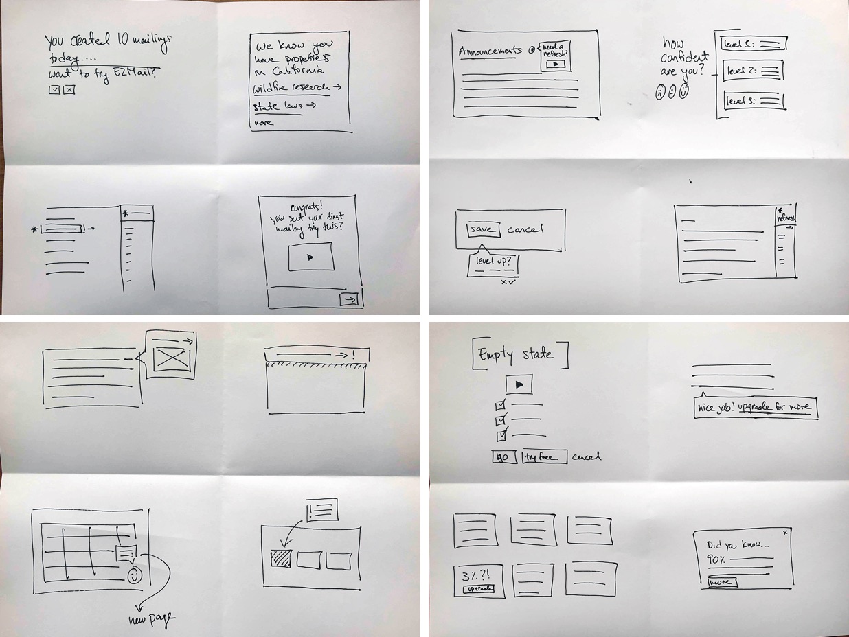
Wednesday: Turn problem statements into ‘How might we’ statements, sketching
Thursday: Group brainstorming on sketches, independent work, refine design directions
Friday: Create research validation plan, draft recommendations, share with stakeholders
Auditing
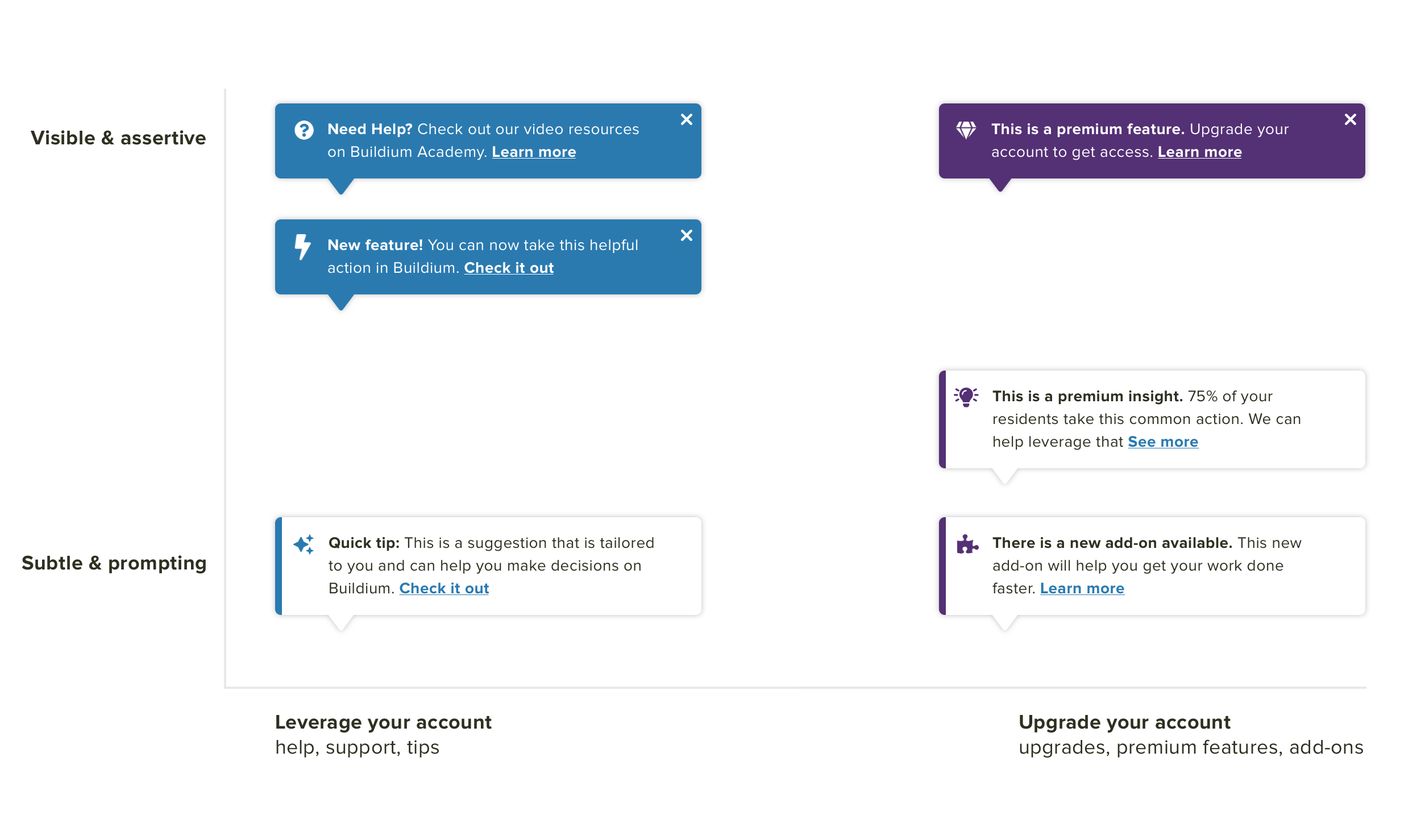
Our first task was to audit what discoverability already existed within the application. Across Buildium, we identified 7 use cases: tips, help articles, upsells, best practices, data insights, new features, and overlooked existing features. Our key takeaways could be summed up in a project statement: the way Buildium handles ‘discoverability’ is far too constrictive. We’re tackling a highly-nuanced problem with a handful of one-size-fits-all solutions. Simply put, there aren't enough patterns or documentation in our toolbox to do the job.
After auditing what was in Buildium, we turned our attention to other softwares which we believed to have “consumer-grade” user experiences. We looked at their use of color, iconography, language and messaging, and vehicle.
How Might We statements + Crazy 4's
On the third day of the design sprint, we turned our hypotheses into four How Might We statements in order to direct our ideation. For each statement, we spent 2 minutes quickly sketching concepts.
Whiteboarding + ideating
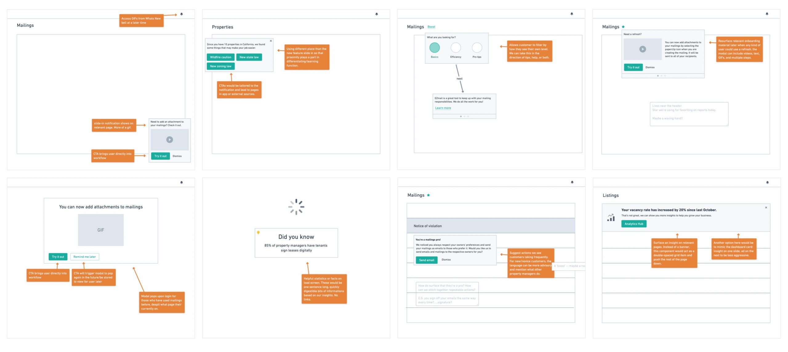
Early high-fidelity designs
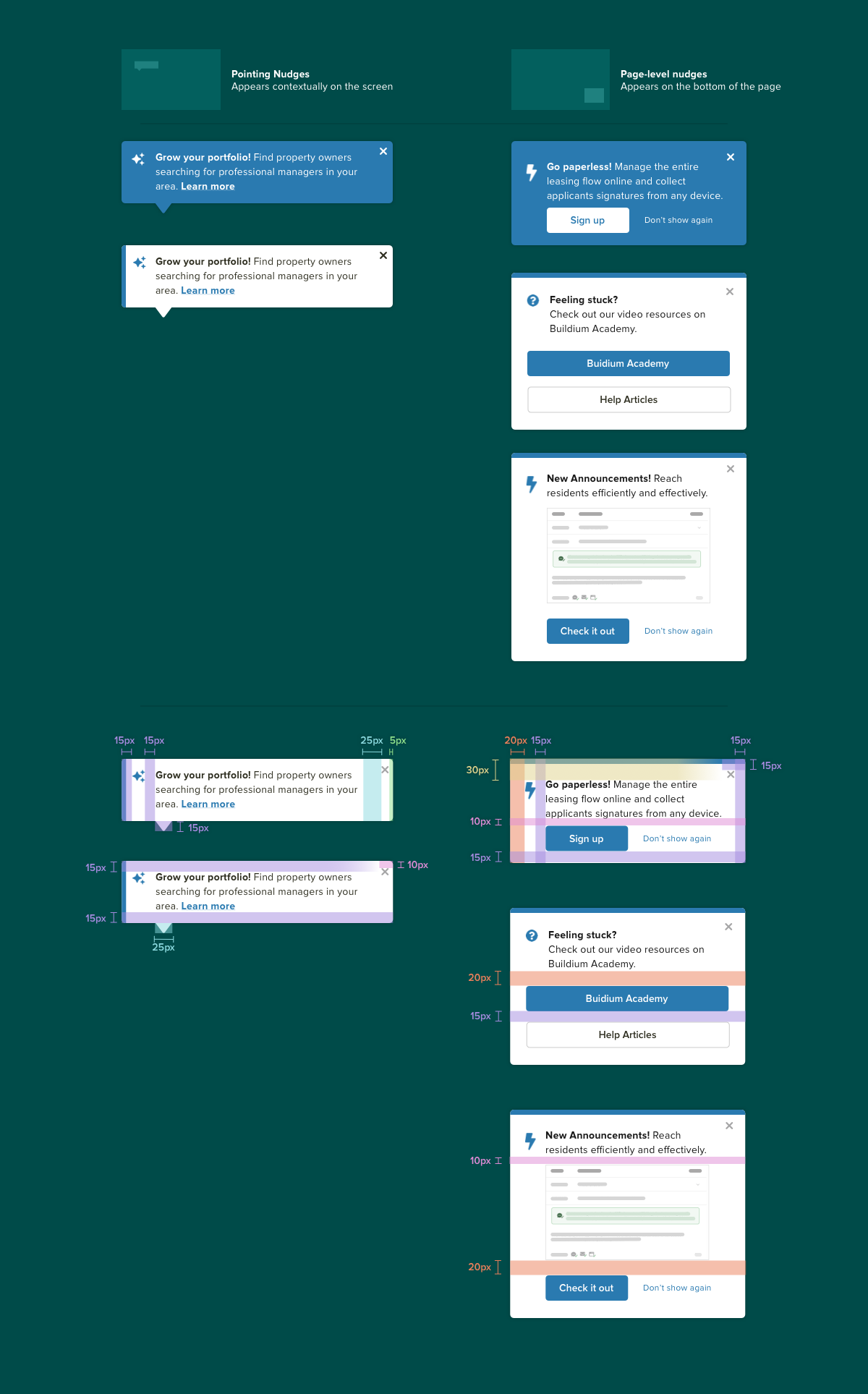
Midway through our design sprint, we had a good sense of what messaging and UI mechanisms would be engaging and supportive for our users. We focused the rest of the week on expanding and documenting three specific patterns. I took responsibility for building out and documenting our ‘nudge’ patterns.
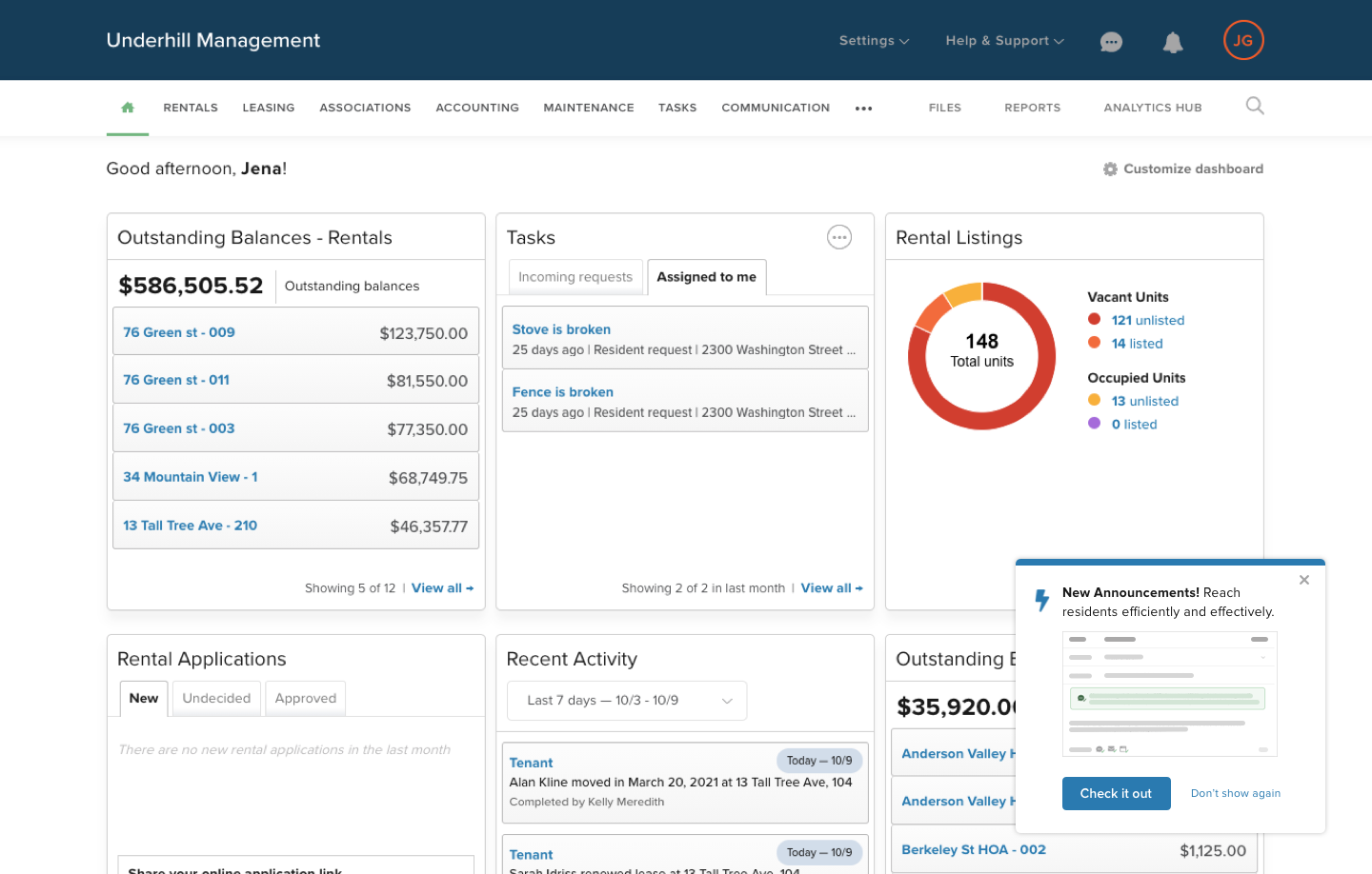
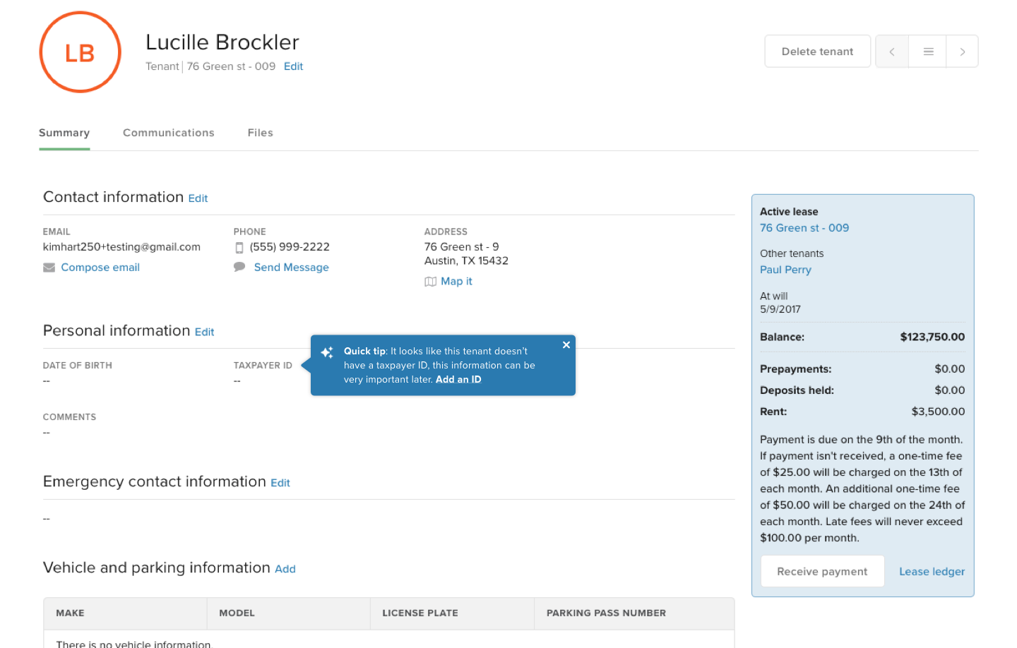
Our definition of nudges: A UI pattern that creates communications between Buildium, the application, and a particular user. Nudges are meant to deliver highly valuable, relevant bits of information at the right time. Common examples include tips to prevent errors and feature spotlights to save time.
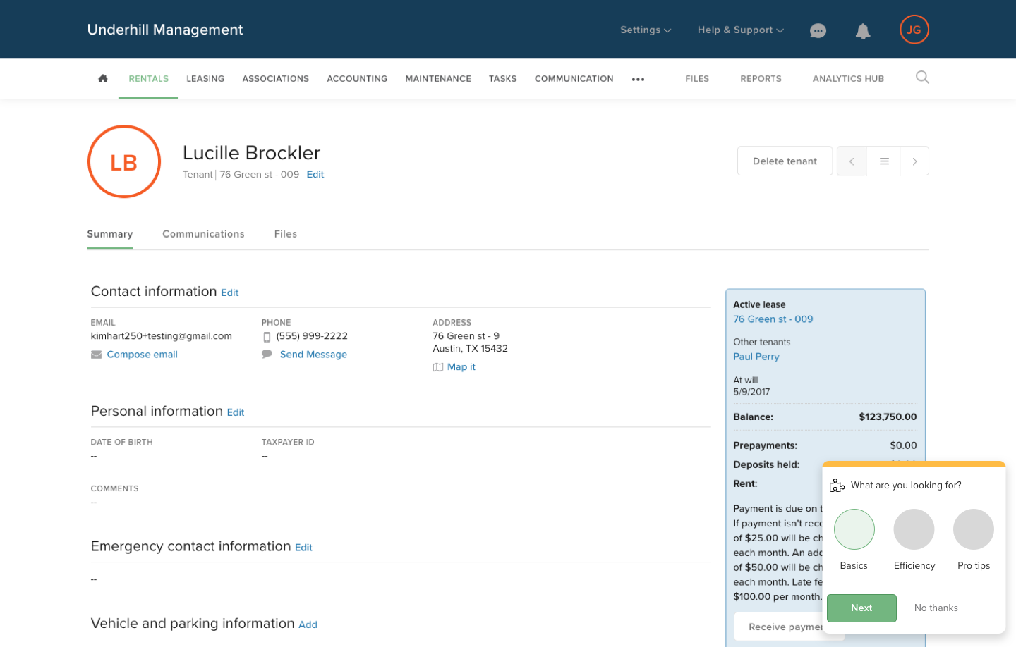
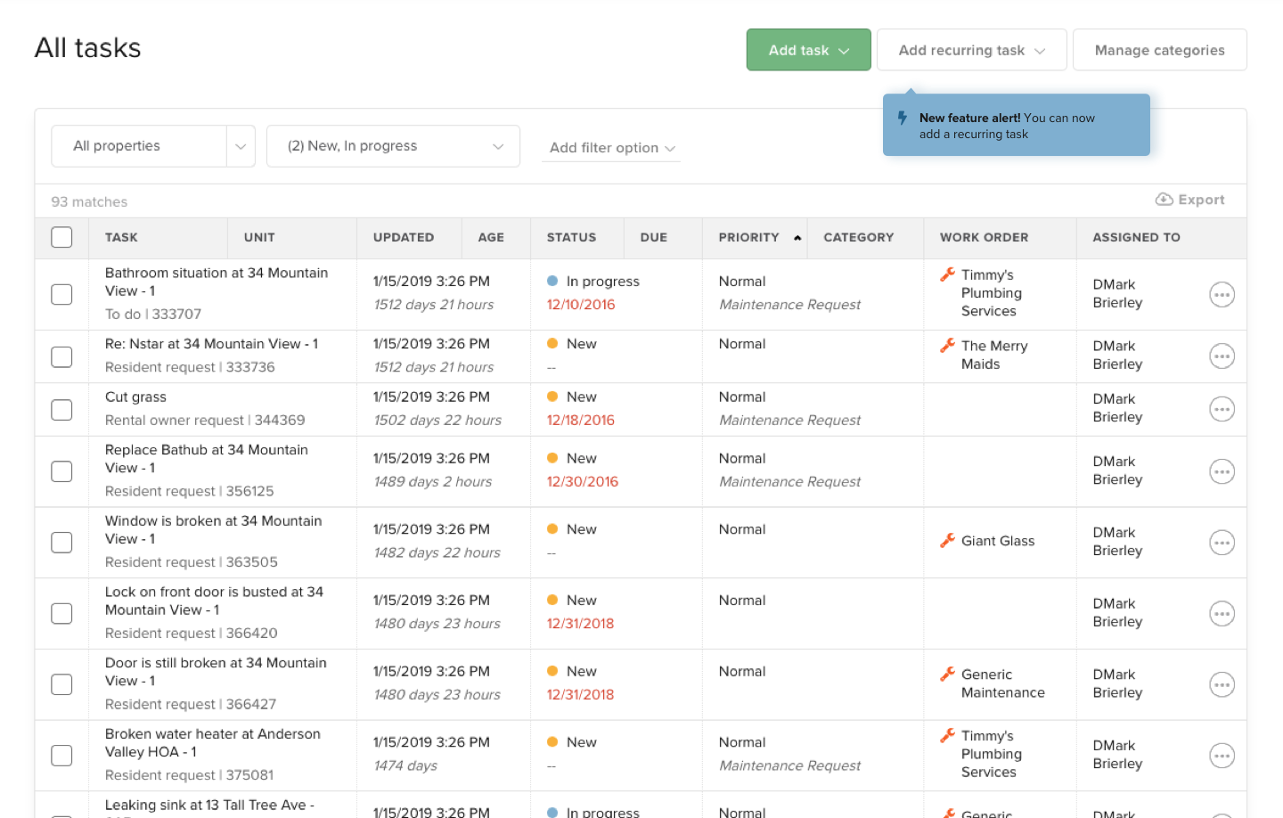
Final designs
At the end of the week, we had documentation to be tested and a research validation plan. As we pressure-tested our designs with use cases and varying workflows, we continued to iterate on the designs.
Documentation
Validation
We knew that a standard usability test wouldn’t get us accurate results for these new patterns since we needed to validate their visibility and effectiveness. To accomplish this, we are weaving these discoverability patterns into other feature usability testing. We are also validating our iconography with unmoderated findability and comprehensibility testing.